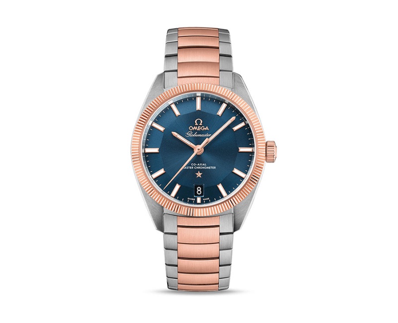
- Online only
- New
- On sale!


World's Fastest Online Shopping Destination
World's Fastest Online Shopping Destination
Lorem ipsum dolor sit amet, mel paulo sonet latine ad, vis te ridens oporteat, tale ipsum facilis pro ei. Utamur deterruisset ea sea. Ferri scriptorem concludaturque ne his, te nostrud patrioque eos, nam no laudem epicuri persequeris.
Product customization
Don't forget to save your customization to be able to add to cart
 Security policy
 Delivery policy
 Return policy
This is a very important decision which will affect the decisions of any other typeface like headlines. Body text is the most common element in a product. This is what all your users will see and experience. As a result, the look and feel of your body text will have the greatest impact on the quality of your design.
For beginners, it’s recommended to stay with one font until you have achieved mastery of that font. Play with the styles. Modern typefaces already come with many different styles, which means they share common distinct weights. Typefaces with a larger range of styles can help you differentiate text in special contexts, like a button or a label. If you still want/need to use more than one font, ensure the font families complement each other.
Good typography not only makes us read but also makes us feel. Typography is a skill that every designer needs to master in the digital age. As with any design project, guidelines and tips are just a place to get started. The first piece of advice is to practice. You only really learn something by doing it. The more you try text styles on, the better idea you will get of how it looks and works for your users. Take this practical guide as a starting point on your road for crafting typography for your screen design.

Data sheet
Specific References
No customer reviews for the moment.